Industry
Non Profit Organization
Timeframe
June 2024 - August 2024 (12 weeks)
Team
1 UX Designer (Me) , 1 Researcher, 1 Project Manager, 1 Visual Designer
TL;DR
This project transformed the NGO's website by tackling key user frustrations around finding essential information. Despite having the content available, users struggled to navigate the site, leading to a flood of inquiry emails. By conducting in-depth UX research and a thoughtful redesign, we streamlined the site’s structure and presentation, delivering a clearer, more intuitive experience that significantly reduced confusion and inquiries.
Furniture Repair Bank
My Responsilibilites
Survey synthesis, Information Architecture, Content Design, High-fidelity prototypes
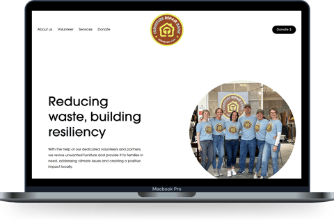


Overview of Furniture Repair Bank
Working closely with Xenia, the founder of FRB, we understood that there were a lot of email inquiries about the donation and volunteer process so we designed a Survey with tasks to understand the areas of confusion.
Understanding "The Problem" from Stakeholders


Refining "The Problem" through Research
Survey & task results
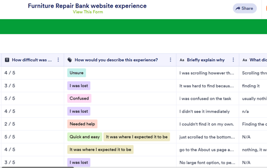
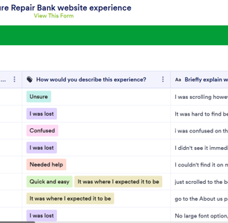
Survey form with tasks for users
We uncovered that the primary challenges stemmed from user-specific issues with the website’s Information Architecture and unclear Content design on specific pages. In addition to these user-focused challenges, we identified the Volunteer Sign-Up Process as a critical admin and business problem.
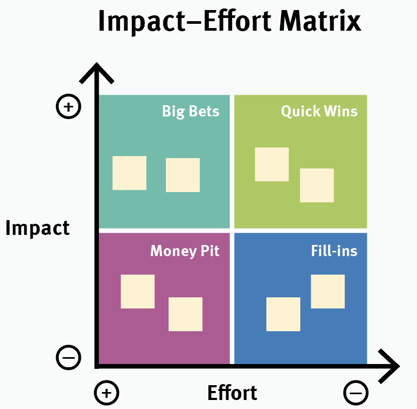

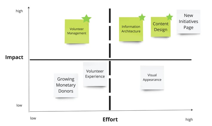

Through the survey and Open Card-sorting exercise insights, we used a Lean prioritization matrix to evaluate potential solutions based on their impact and effort. This strategic approach led us to focus on :
Quick Wins — improving Volunteer sign-up process
Big Bets — Information Architecture & Content Design.


Solution 1 : Content Design
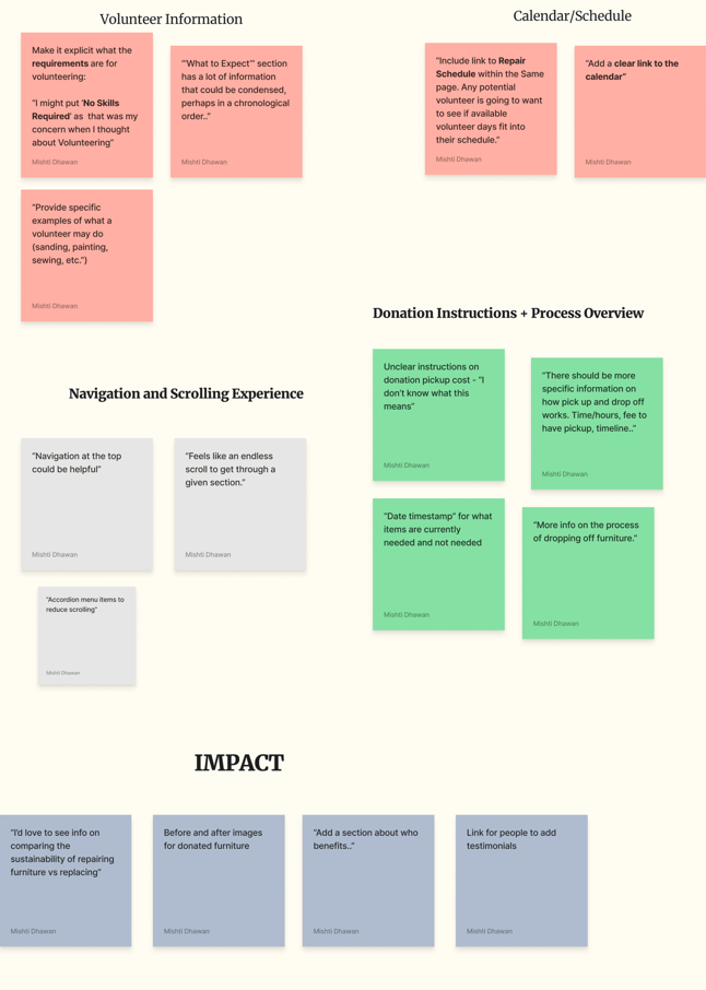
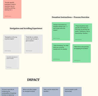
Survey Analysis

Click on the image to View in Detail
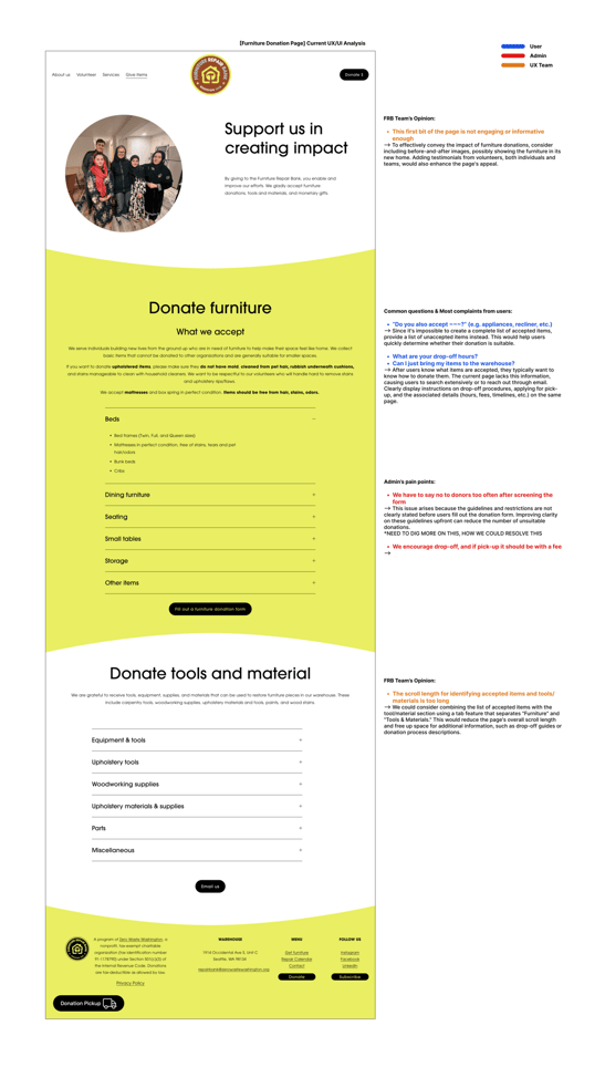
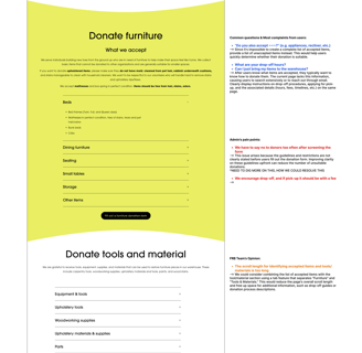
Pain Point Analysis

Click on the image to View in Detail
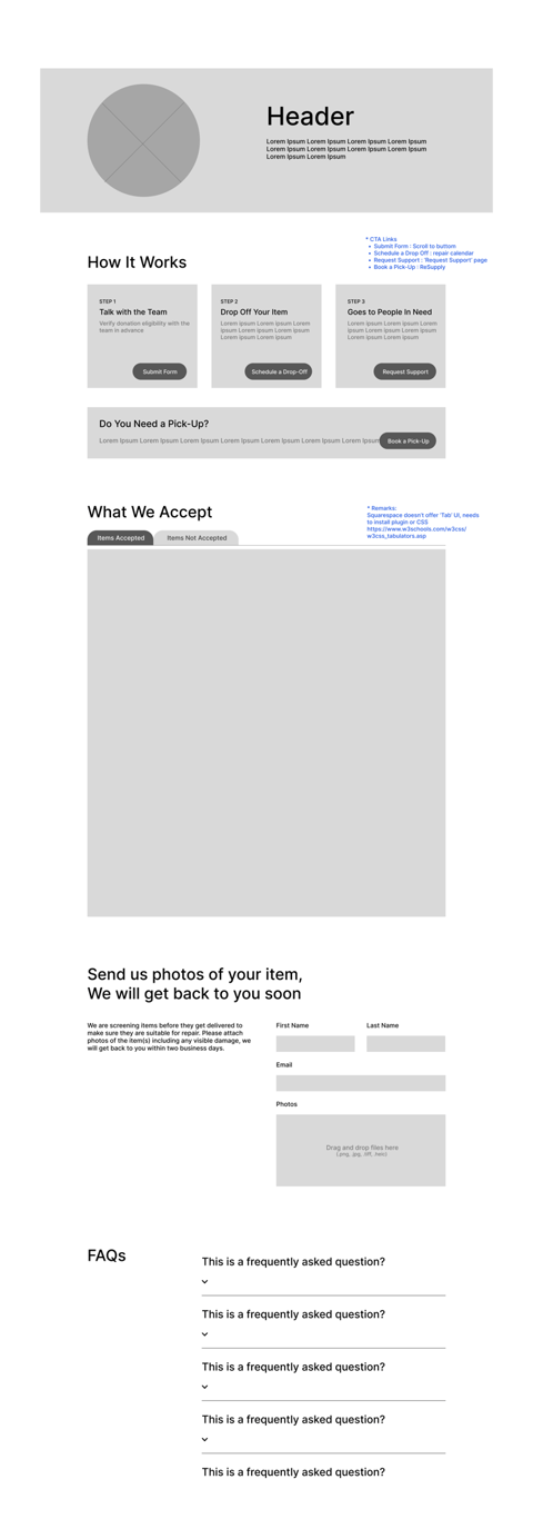

Low Fidelity Prototype
High Fidelity Prototype


The current website has an umbrella page - “Join us” which has a lot of essential information, but is hard to digest for potential volunteers due to overwhelming information and a lot of scrolling needed
Our redesigned umbrella page highlights the impact of volunteering and clearly presents the ways someone could volunteer. The two main ways to volunteer: individual and group, each have their dedicated page that provides more clarity on the process.


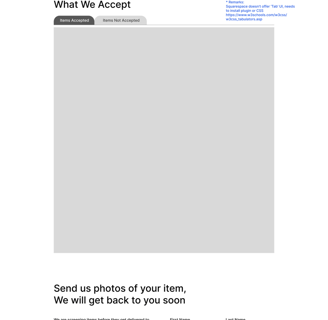
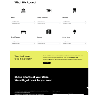
In our redesign of the furniture donation page we saw:
First, users struggled with missing and scattered information. We solved this by adding and prioritizing content that aligns with the user’s mental model, focusing on accepted items, pickup services, the donation process, and FAQs.
Secondly, users felt lost due to the lack of instructions for what to do next. We visualized the donation process and added clear calls-to-action, like ‘request pick-up’ and ‘schedule drop-off'.
The repair calendar shows all the events and warehouse hours and used both by volunteers and furniture donors to email the client and sign up or drop off items, which was not clearly stated.
We redesigned the repair calendar highlighting the most important information: warehouse hours and location, and breaking things down based on user intent.
Now, both sets of target audiences can easily read the calendar for their use case and can clearly see the action required on their end.
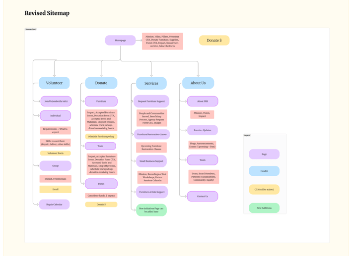
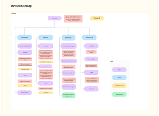
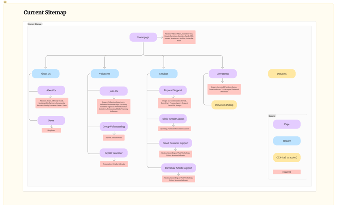
The client had often received email queries from users not being able to find some information on the website. That was our first evidence for the information architecture to be improved upon. Basis our observations, we updated the sitemap for more intuitive navigation and easy access of important information that was otherwise buried deeper.
The key changes we made were:
VOLUNTEER:
- An umbrella information page that gives out details about volunteering experience which users often enquire about to the client
- Better division of information between Individual and Group volunteers via separate pages
- Repair Calendar for easy scheduling
DONATE/SUPPORT US:
- Was initially a single page that focussed on furniture and tool donations, it is now segregated into different ways anyone can donate for the cause (furniture, tools, funds)
ABOUT US:
- Aims for a better segregation of information via separate pages about the organisation, announcements, the team and contact details. Initially it was clubbed together, which made it difficult for users to find the right information needed.

Solution 2 : Improve Information Architecture
Final Impact


TrailVault
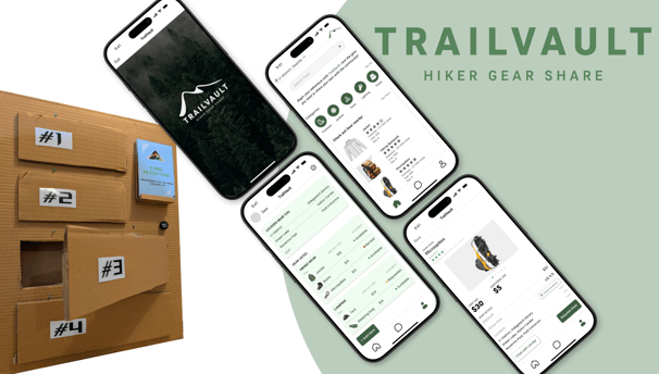
As part of the User-Centered Design course at UW, I collaborated on a project focused on hiking inspired by our love for nature and sustainability. We identified barriers like limited rental options and designed a locker-based gear-sharing system.


Check out my other work:


The current volunteer management system is completely manual. The volunteer fills out the form and the client manually emails them to confirm and asking the date that works for them.
As a result, the FRB team has to send out at least 2 emails just to sign up one volunteer.

