Improving Discoverability
through Website Redesign
Solving complex navigation through Information Architecture restructuring and progressive load.
Client
Andrew Well, Founder
Timeline
Oct - Dec 2025
Team
Project Manager [Grace]
Lead Researcher [Me]
UX Designer [Me & Jie]
Visual Designer [Yiyang]
Tools
Google Analytics
Optimal Workshop
[Card Sorting]Figma
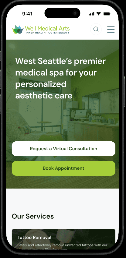
BEFORE
TL;DR
A 10-week research-led redesign of a West Seattle medspa's mobile website — making it easier for first-time patients to discover treatments, understand pricing, and book appointments.
What is Well Medical Arts?
Well Medical Arts is West Seattle's premier medspa — founded in 2006, serving a wide range of patients across aesthetics, wellness, tattoo removal, and weight loss. Despite strong in-clinic reputation, their website had a serious problem: information overwhelm was costing them patients.
When Andrew reached out for a redesign, he framed the core tension clearly: "We've been successful in search by throwing content at Google — but this has created a very information-dense experience that needs to be distilled down to the basics." The data backed this up immediately.
DATA ANALYSIS
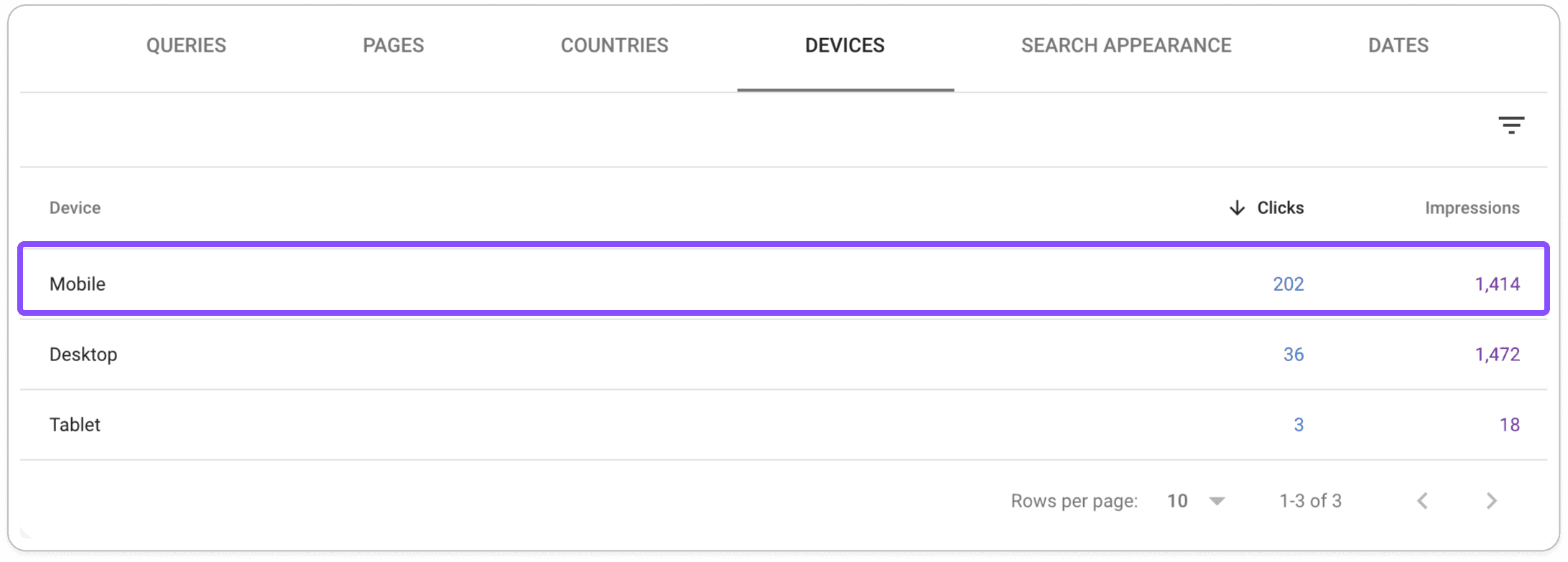
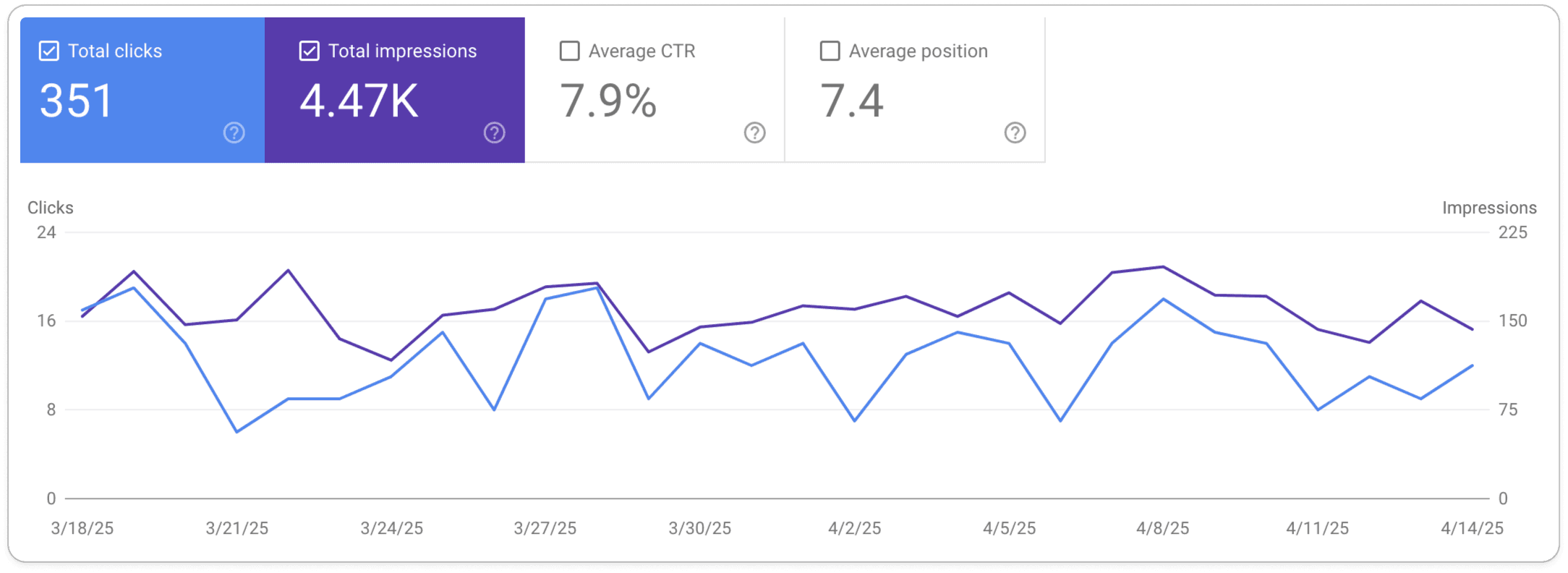
Google Analytics Data
84
%
of site traffic came from mobile devices — yet the site had no dedicated mobile strategy
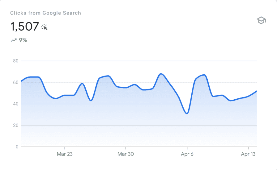
~55 visitors/day
mostly from direct brand searches — new patients were not finding them organically
7.9
% CTR
This is well above the Industry average which is 6.11%
While Google search successfully drove traffic to the website, it failed to convert visitors into patients — what's causing the drop-off?
Stakeholder Interview
Interviewed the Clinic Director (Andrew) and 2 front-desk staff members. Uncovered that most incoming calls were basic questions about pricing and booking — information that was on the website but hard to find.
Business Goals
Consultation Conversion
Appointment Conversion
Usability Goals
Ease of Navigation
Information Clarity
Research Question
New patients were able to discover this website but that did not lead to Conversion - Why?
7.9
%
search click-through rate — well below industry benchmarks, signaling SEO and UX issues
~55
daily visitors, mostly from direct brand searches — new patients were not finding them organically
Turning a messy site into a research question
As Lead UX Researcher, I was responsible for the full research arc — from defining research goals through to synthesizing insights that directly shaped design decisions.
The site had over 60+ treatment pages with no consistent structure, jargon-heavy navigation, and duplicate categorization.
My job was to make sense of it — and then help design something a first-time patient could actually navigate in under 30 seconds on their phone.
What the research revealed
Four themes emerged consistently. These became the north stars for every design decision we made.
INFORMATION ARCHITECTURE
Navigation is the #1 barrier for new patients
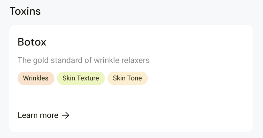
The original menu had 11 top-level items, many using clinical jargon like "Botox/Toxins" and "Fillers/Threads." Front-desk staff confirmed that many callers were looking for information that existed on the site — they just couldn't find it. Heuristic evaluation found duplicate categorization (Tattoo Removal appearing in two different nav items) and zero visual hierarchy.
DISCOVERABILITY
Pricing confusion drives phone calls, not bookings
76% of survey respondents ranked cost as the top factor in treatment decisions, yet pricing on the site was buried under "About" — completely outside of where users expected it. During usability testing, participants rated finding pricing at 2/5 ease. One participant looked in 3 different places before giving up.
MENTAL MODELS
First-time patients think in concerns, not treatment names
The card sort revealed that users consistently grouped treatments by the outcome they wanted (e.g., "wrinkle reduction," "skin texture") — not by the clinical procedure name. This directly contradicted the original site structure and became the foundation for the redesigned IA. Andrew confirmed this matched what he saw with real patients.
CREDIBILITY DESIGN
Trust signals are missing — and patients notice
Survey data showed that 79% of users discovered medspas through personal recommendations and 49% cited positive reviews as a top decision factor. Yet the existing site buried reviews and had no visible before/after photos on treatment pages. Competitive analysis showed all three competitors prominently featured real patient testimonials on their homepages.
User Persona
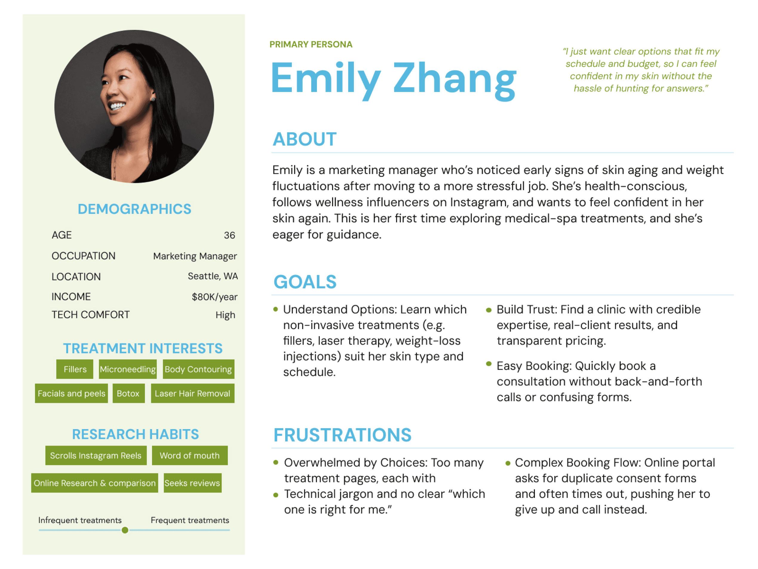
PRIMARY PERSONA
First Time Patient
Curious & Goal-driven, but may feel overwhelmed
Need clear guidance, trustworthy info, and an easy way to find the right treatments.
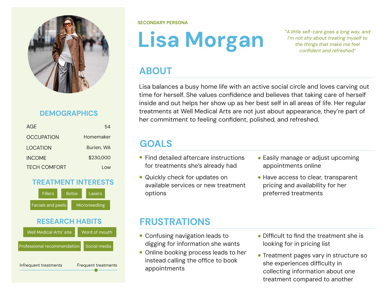
SECONDARY PERSONA
Returning Patient
Familiar with the site
Efficiency-driven; want quick navigation and easy bookings
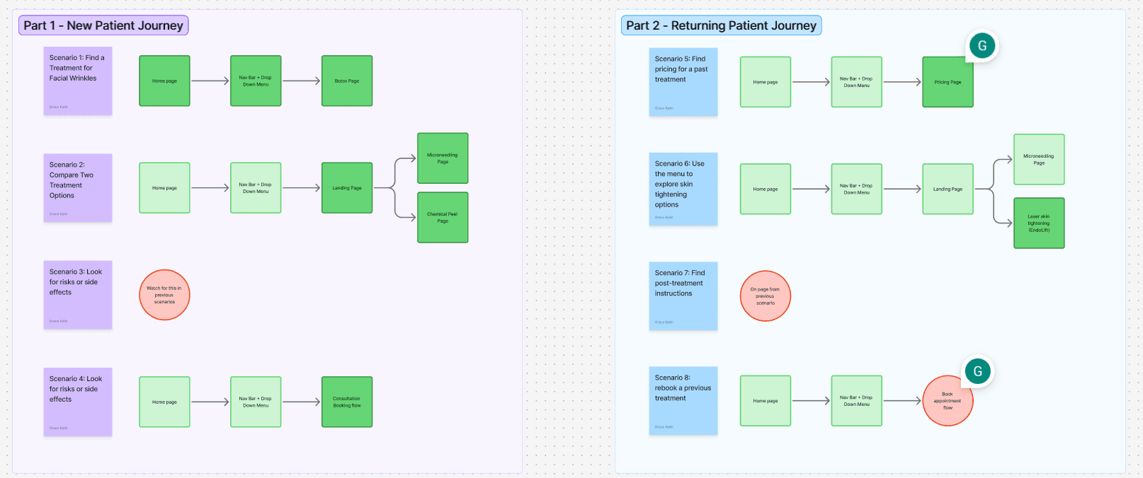
User Task analysis
Personas tell you who the user is — task analysis tells you where the design fails them.

Card Sort Insights
When the site has 60+ pages and no clear logic, you don't reorganize by gut — you let users show you how they think.
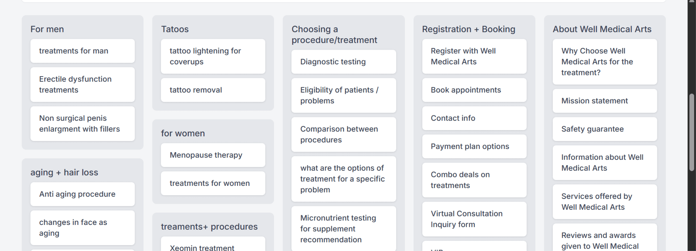
> In-clinic procedures (e.g., Botox, chemical peels) were consistently grouped together.
> Multi-session treatments formed a separate, distinct category.
> Clear separation between aesthetic services & wellness treatments.
> Users expected detailed procedure information on each individual service page.
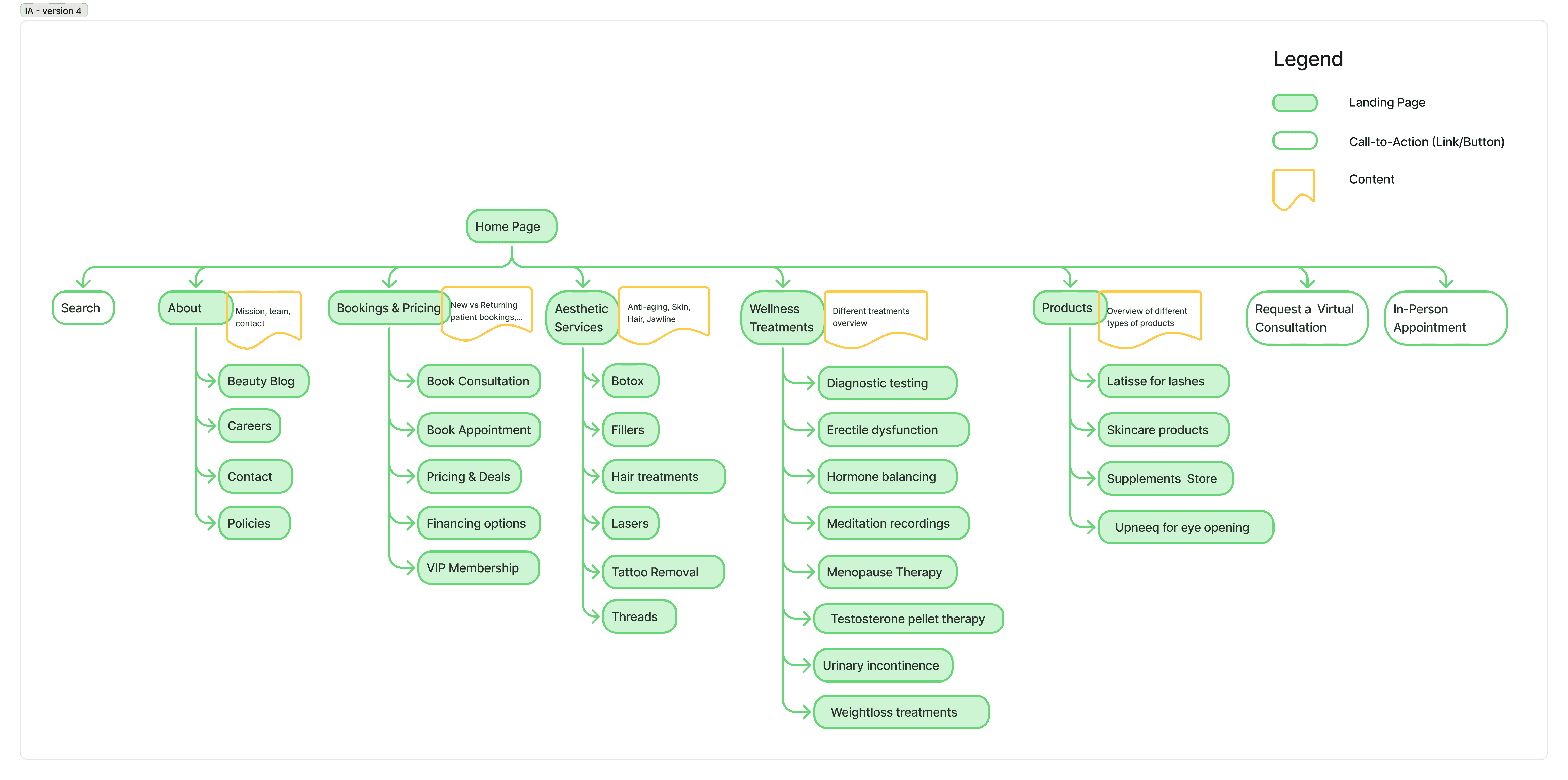
Updated Information Architecture [after 3 iterations]
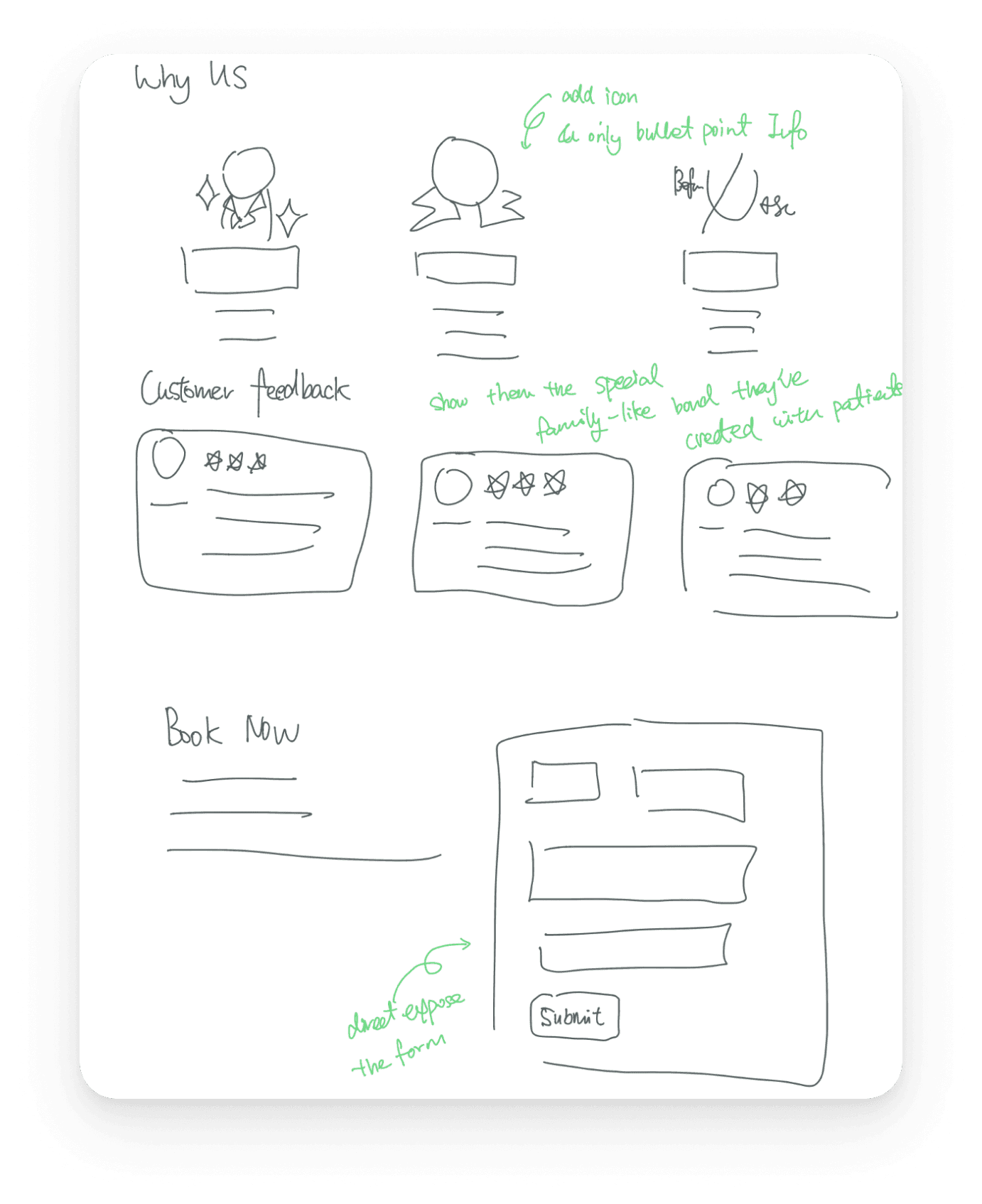
Initial Design Sketches

Updated Information Architecture [after 3 iterations]
Updated Information Architecture [after 3 iterations]
Updated Information Architecture [after 3 iterations]
Iteration 1 Design & Usability Test Result:
We conducted usability testing on the first iteration — before moving to high-fidelity design — to validate whether the new IA and navigation structure actually worked for real users, not just in theory. Tasks were scenario-based and split across two user types: a first-time patient finding, comparing, and booking a treatment, and a returning patient locating aftercare information. Usability testing was how we'd find out if they actually reduced friction or just moved the problem around.
1. Category labels don't match user mental models
The user navigated to "Skin" expecting to find wrinkle treatments, but Botox lives under a separate category; reinforcing the concern-tag system as essential.
2. "About" is the last place anyone looks for pricing
User 3 explicitly said she only expected About to have team info, facilities, and testimonials — not a price list. This confirms the pricing placement is a critical IA error, not just a visual one.
3. Booking CTA placement kills conversion
The user completed the task successfully but explicitly noted the consultation button was "too low" — they had to scroll past it. A task that should feel effortless required hunting.
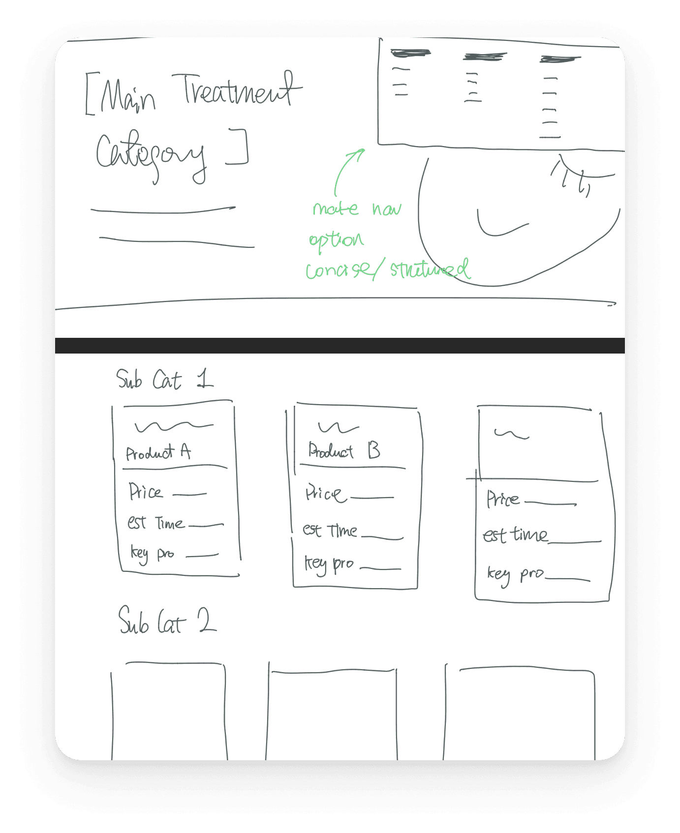
Final Designs
Home Page
Navigation bar
Treatment Page
All Services page
Key Design Decisions
Treatment Name VS Concern

Updated Information Architecture [after 3 iterations]

Updated Information Architecture [after 3 iterations]
Solution: Best of both worlds
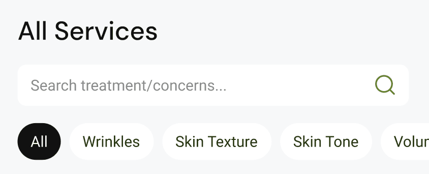
Added Treatment as Main Category
Concerns as Filter & Tags
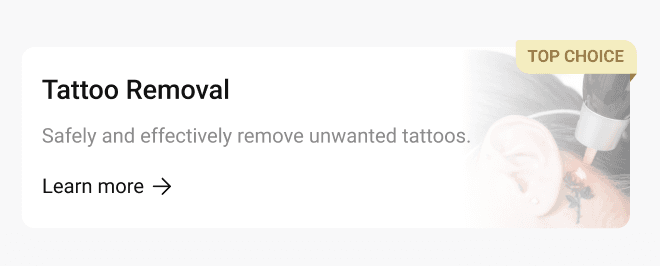
Highlight Popular treatment
On Home Page
All Services Page
Easily digestible [important] information
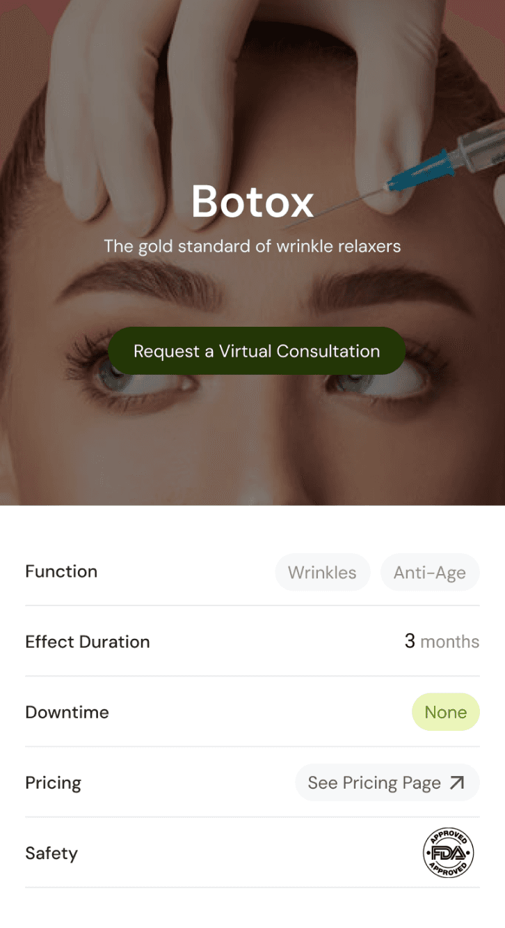
Add a summary section in treatment detail page including most important information for New Patients:
Concern [Wrinkles, Anti-Ageing, etc]
Effect Duration
Downtime
Pricing
If treatment is FDA approved
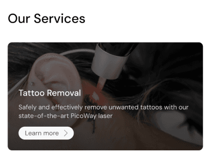
Consultation & Appointment Booking easily accessible

CTA on Home Page
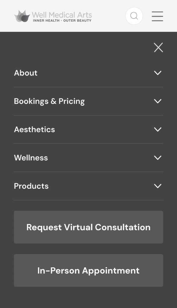
CTA in Navigation menu
CTA on all Treatment pages
Challenges & Learnings
Domain expertise and user research aren't in conflict
Andrew's knowledge of his patients was invaluable — and often confirmed what we found in research. The best insights came when we triangulated his domain knowledge with our card sort and usability testing data.
Deadlocked design decisions are research questions in disguise
When the team couldn't resolve the concern vs. treatment debate, I turned it into a card sorting exercise. The answer came from users, not opinions. That became my biggest methodological takeaway from this project.
What I'd do differently next time
Our usability test participants were tech-savvy grad students — not the 45–65-year-old patient demographic Andrew described. In a real-world engagement, I'd recruit participants who more closely match the target user to get higher-fidelity insights.